
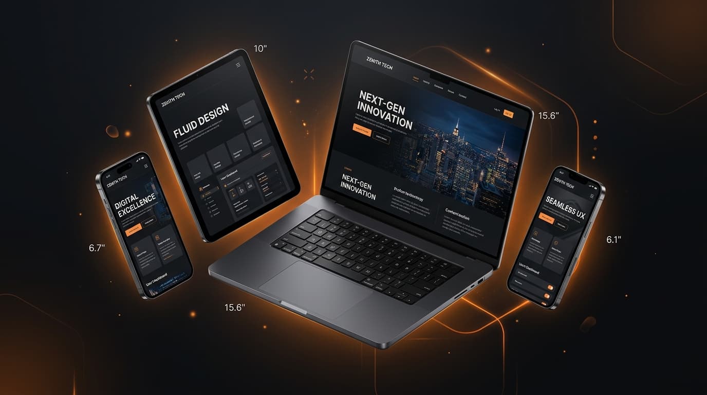
Flawless Multi Device Experiences Across Mobile Phones, Tablets and Desktops
Ensuring your website looks stunning, loads instantly, and operates naturally across all screen resolutions, from compact mobile phones to ultra wide 4K desktop screens.
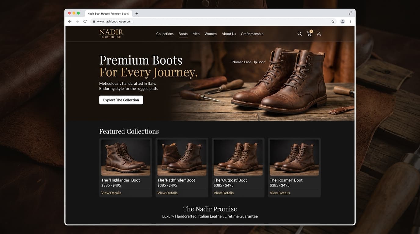
Over 65 percent of modern web traffic originates from mobile devices. My responsive web design methodology ensures your digital product adapts effortlessly to any screen size without clipping text, overflowing layout bounds, or frustrating users.
Every detail is meticulously planned and executed to exceed expectations.
Mobile First Architecture
Designing the core experience for mobile first, then progressively enhancing for larger screen real estate.
Fluid Typography Scales
Headings and body text that scale proportionally with viewport width for optimal readability on any device.
Touch Optimized Controls
Finger sized tap targets, swipeable carousels, and thumb reachable navigation elements.
Dynamic Asset Delivery
Serving compressed webp images sized precisely to the user screen, saving cellular bandwidth and battery.
Industry standard technologies powering this service for performance, longevity, and scalability.
A structured 4 stage delivery path guaranteeing quality, transparent communication, and timely milestones.
Breakpoint Definition
Identifying key viewport thresholds for smartphones, vertical tablets, landscape tablets, and monitors.
Layout Reorganization
Restructuring multi column desktop layouts into streamlined single column mobile feeds.
Touch & Interaction Tuning
Adapting hover menus into tap toggles, optimizing scroll containers, and removing lag.
Real Hardware Testing
Validating performance on actual iOS and Android devices to guarantee consistent rendering.
Clear answers regarding timeline, deliverables, and service implementation.
Ready to start with Responsive Website Design? Let's discuss your ideas and turn them into a modern digital experience.